ESMA Ligature Logos
- Nov 29, 2017
- 1 min read


Ligature Logo Project
Date: 11/22/17
What is a ligature logo?
A ligature logo is blending two or more letters into one.
How would describe the corporate identity of ESMA in 5 words?
Diverse, Modern, World Class,Distinguished, and Revolutionary.
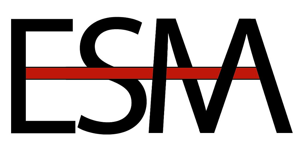
Which logo out of the two do you feel is the strongest and why?
I feel like my first logo is my strongest because I believe that the mid letter cross bar and the interlocking all go together to form a sleek modern logo for ESMA.
If you had no requirements or restrictions how would your logo look different?
I might have made the logo a little different by making different designs that weren’t some of the requirements.
Explain which ligature techniques you have demonstrated on each logo:
For the first logo I used mid letter crossbar and interlocking.
For the second logo I used building bridges.


Comments