Font Pairing
- Nov 6, 2017
- 2 min read


Font Pairing Project
Date:11/6/2017
What does it mean to create a font pairing?
A font pairing is taking two fonts that go nicely together or that complement one another.
What are the four assignments you chose to do? Write the name of the assignment and describe your design for each.
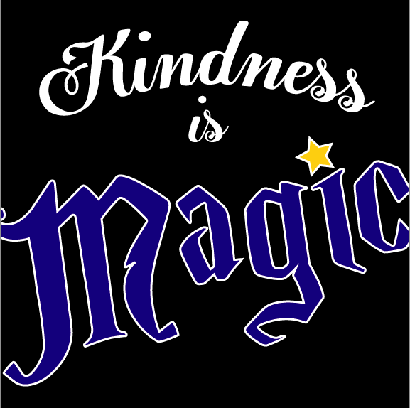
“Kindness is Magic”: For this assignment I made a font pairing of the words “Kindness is Magic”. I used a script font for the word kindness and is then I used a crazier Harry Potter themed font for the word magic. I also put the dot in the letter I in the word magic a star so the word would stand out more.
CREATE A FONT PAIRING FOR ANY DESTINATION: For this assignment I used a font pairing for the location Manhattan, New York. I used a New York City themed font for the word Manhattan and a more simplistic font for New York. I put both these fonts on a high quality photo of the Empire State Building.
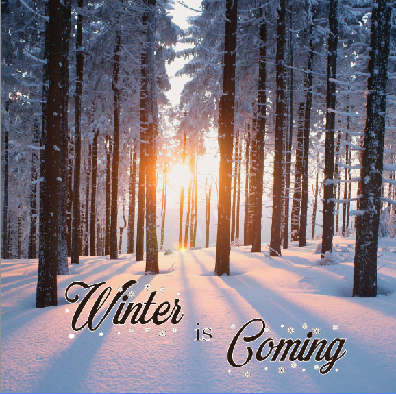
CREATE A FONT PAIRING FOR THE PHRASE “Winter is Coming”: For this assignment I made a font pairing of the phrase Winter is Coming. I used a script font with snowflakes around it for the words “winter” and “Coming” and then used a simpler font for the word is to make the words “winter” and “coming” to stand out. I put this font pairing on a high quality photo of trees in the winter.
CREATE A FONT PAIRING FOR THE SAYING: Hot and Fresh out of the Kitchen”: For this assignment I created a font pairing making the words ‘Hot”, “Fresh”, and “Kitchen” in a script font. The other words I put in a simpler font to make the other words stand out. I put these words on a warm brown background with a graphic of a steaming pie on the bottom.
Which assignment would you say is your BEST font pairing and why?
I would say my best font pairing would be the Location Font Pairing. The fonts I used looked good together and they look very good on the high quality photo of the Empire State Building
Which assignment would you say is your Least Successful font pairing and why?
Out of all my assignments my least favorite would be the kindness is magic. I think it looks good but I do not think it is as strong as my other font pairings.
How would you describe the font pairing process? What makes a font pairing so difficult?
It is a fun but sometimes challenging process. It is hard to find two fonts that are different but also complement each other and look nice.


Comments